UX Case study
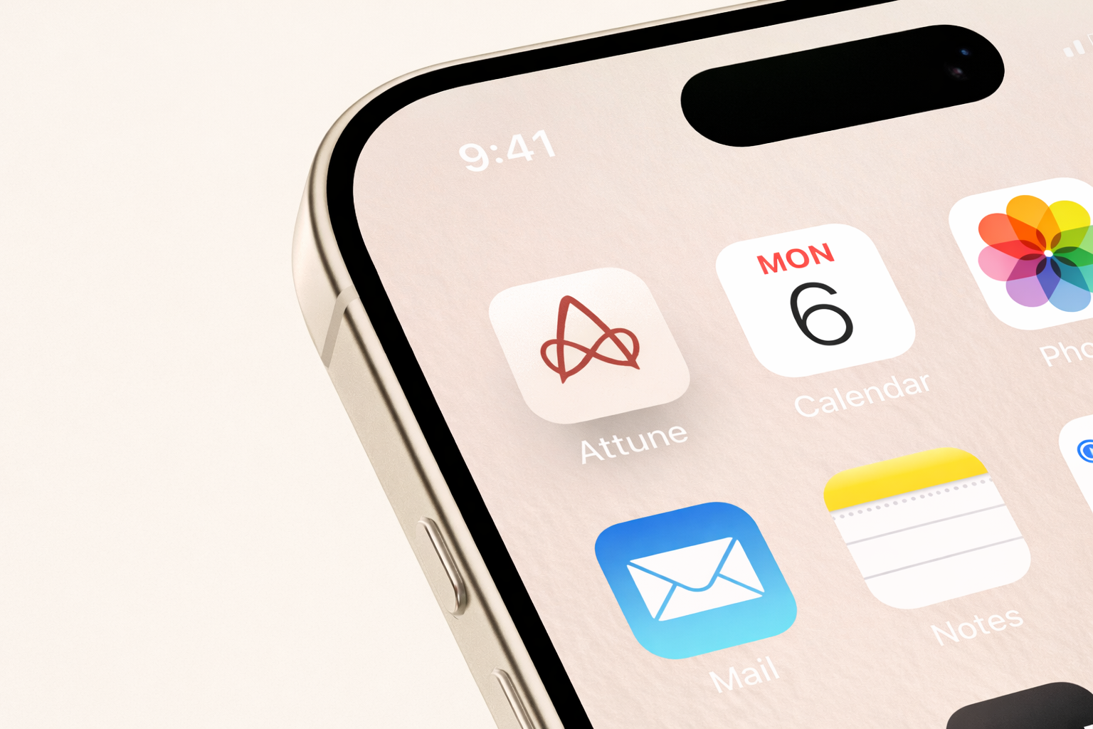
Attune
Designing a stress-aware task management app to reduce pressure and support focus.
Role: UX/UI designer
Timeline: November 2025 - February 2026
Responsibilities:
This was a solo project where I handled the entire UX process, including research, ideation, wireframing, visual design, and prototyping.
Understanding the user
Problem:
Many people struggle to stay consistent with task-management apps and completing their daily responsibilities. Conventional task managers often do not consider the user’s current headspace, mental load, or changing needs, which can make productivity feel overwhelming instead of helpful.
Long task lists, rigid structures, and pressure to stay on track can make it difficult to start or finish tasks, especially when users feel stressed or mentally overloaded. When tasks feel too large or systems feel too strict, users may begin to avoid them altogether and eventually stop using productivity tools.
user personas
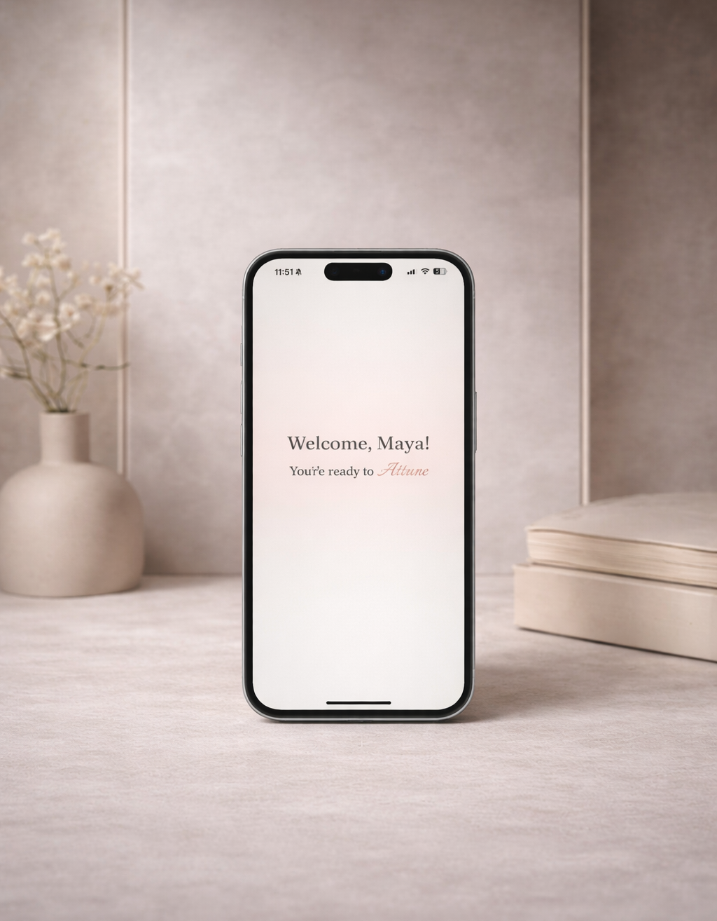
Maya
Overwhelmed Student
Age: 20
College Student
Bio:
Often feels overwhelmed when tasks pile up and struggles to stay productive when mentally drained. Uses planners and reminder apps but becomes stressed when everything comes at once, sometimes avoiding tasks and feeling guilty when things don’t get done.
Needs:
Break tasks down
Flexibility
Encouragement
“I start to get overwhelmed when I plan it all out and see everything I have to do.”
“I usually know what I need to do, but I don’t always have the energy, and then the whole list starts to feel overwhelming.”
“When your mental energy is low, how likely are you to put off or avoid tasks?”

Emily
Low-Energy Avoider
Age: 18
Student / Part-Time Job
Bio:
Notices their mental energy dropping throughout the day and often puts off tasks when feeling tired or stressed. Traditional task apps can feel pressuring, making it harder to start work and increasing anxiety as the task list grows.
Needs:
Pause tasks function
No harsh deadline reminder
Low pressure
“[To-do list apps] make me anxious and stressed because I feel like I should be doing something, but I don’t have the energy.”
Alex
Deadline Pressured Planner
Age: 26
Full-Time Employee
Bio:
Tries to stay organized using calendars and task apps, but strict deadlines and packed schedules can create pressure when plans change. When tasks need to be moved or paused, they often feel guilty, even when the workload is unrealistic.
Needs:
Flexible scheduling
Ability to pause tasks
Less pressure
“I feel disappointed in myself for not just powering through and getting everything done.”
Pain points
2. Emily
No Energy Flexibility
Most task tools don’t adapt to users’ energy levels, making productivity feel unrealistic when users feel mentally drained.
3.Alex
Guilt-Driven Deadlines
Rigid schedules and deadlines create pressure and guilt, especially when users need to pause, move, or slow down their work.
1.Maya
Overwhelming Interfaces
Traditional task apps often feel cluttered and stressful, causing users to avoid their task list when it becomes too long.
Research
research Goal
Method
The goal of this research was to understand why users struggle to stay consistent with task-management apps and to identify the challenges that make tasks feel overwhelming, difficult to start, or hard to follow through on over time.
I conducted a survey of students, part-time workers, and full-time workers between the ages of 18 and 30, as well as reviewed secondary research on productivity tools to learn about users’ experiences, habits, and frustrations when managing tasks.
key insights
65% of participants reported feeling mentally drained during a typical day, showing the need for a task system that adapts to energy levels.
65%
Feel mentally overwhelmed daily
71% said they are more likely to delay tasks when their energy is low, indicating that productivity tools should respond to mental state.
71%
Procrastinate when energy is low
92% reported feeling stress or guilt when tasks are not completed, suggesting that traditional task apps create pressure instead of support.
92%
Feel elevated stress when tasks are unfinished
Define
How might we…
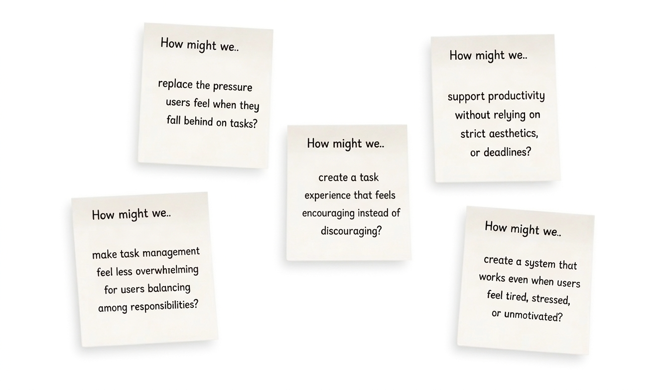
Problem
Design approach
solution
A low-pressure task-management app designed to support users’ mental energy instead of forcing constant productivity. An app allowing users to choose what to work on based on how they feel, adjust tasks, and stay organized through a calm, flexible interface that reduces overwhelm and discouragement.
Ideate
Deciding the final approach
Using my research, How Might We questions, and user personas, I brainstormed different ways the app could reduce pressure, support energy levels, and make task management feel less overwhelming.
Goal
Low-Pressure Flow
Flexible productivity designed to reduce stress and support realistic work habits.
Energy-Based Tasks
Choose tasks based on current energy, not strict priority lists
Reset & Release
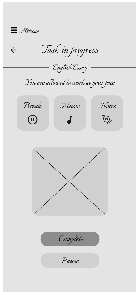
Attune includes a break button, pause task option, and a release page for unloading thoughts. Tasks stay saved, notes are stored separately, and users return to the same task after taking a break.
Calm Interface
Minimal visuals and clear structure to keep cognitive load low.
No-pressure interaction
The interaction design removes streaks, progress indicators, warning colors, and harsh alerts to prevent the interface from feeling punitive. Optional due dates, flexible task controls, and limited task visibility reduce pressure and help prevent cognitive overload.
Adaptive task system
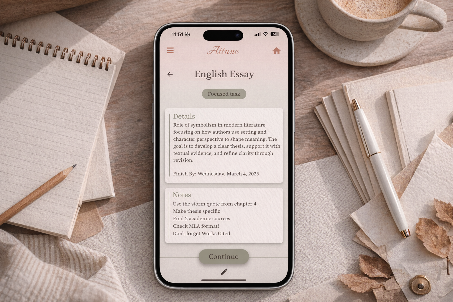
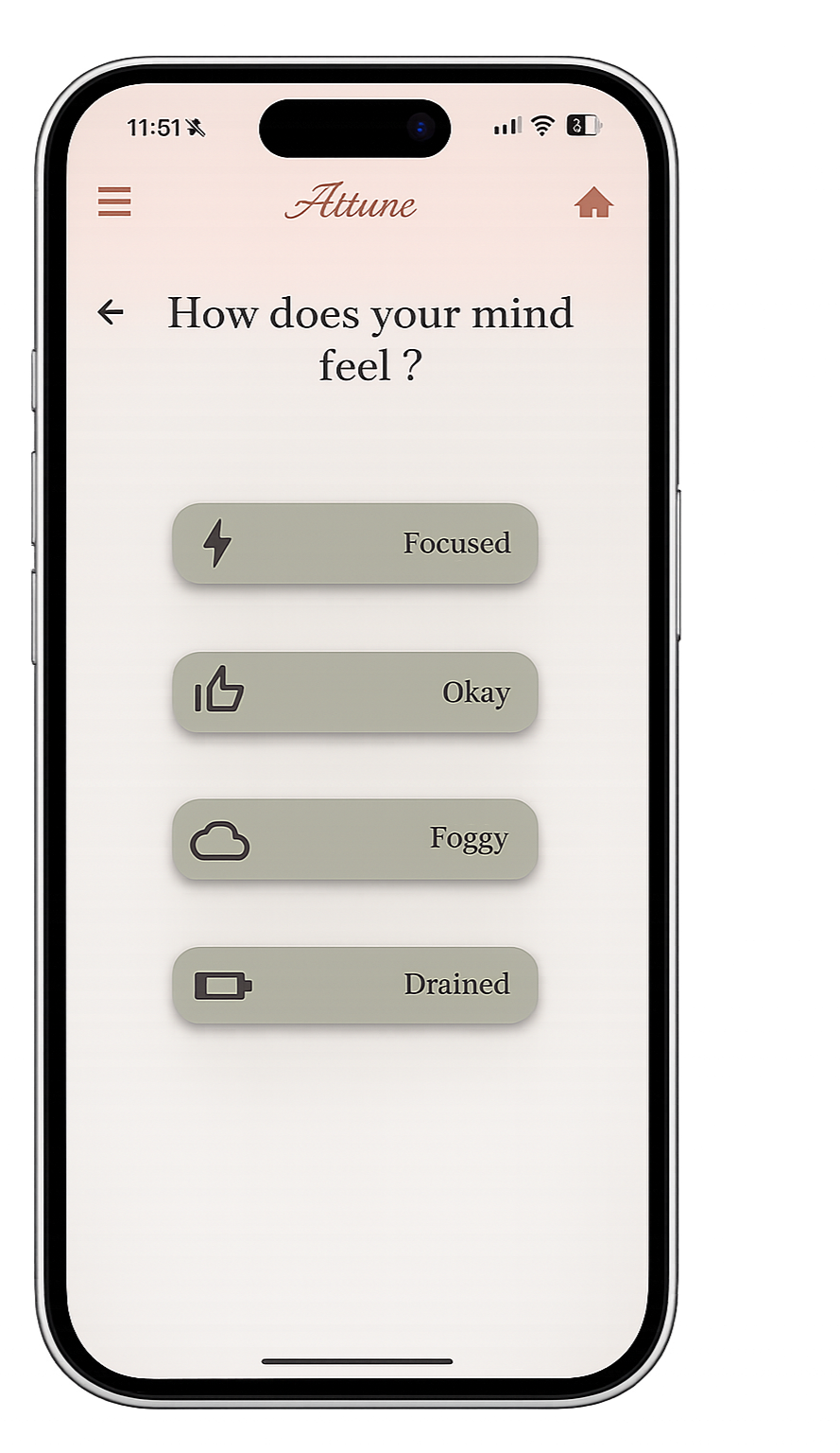
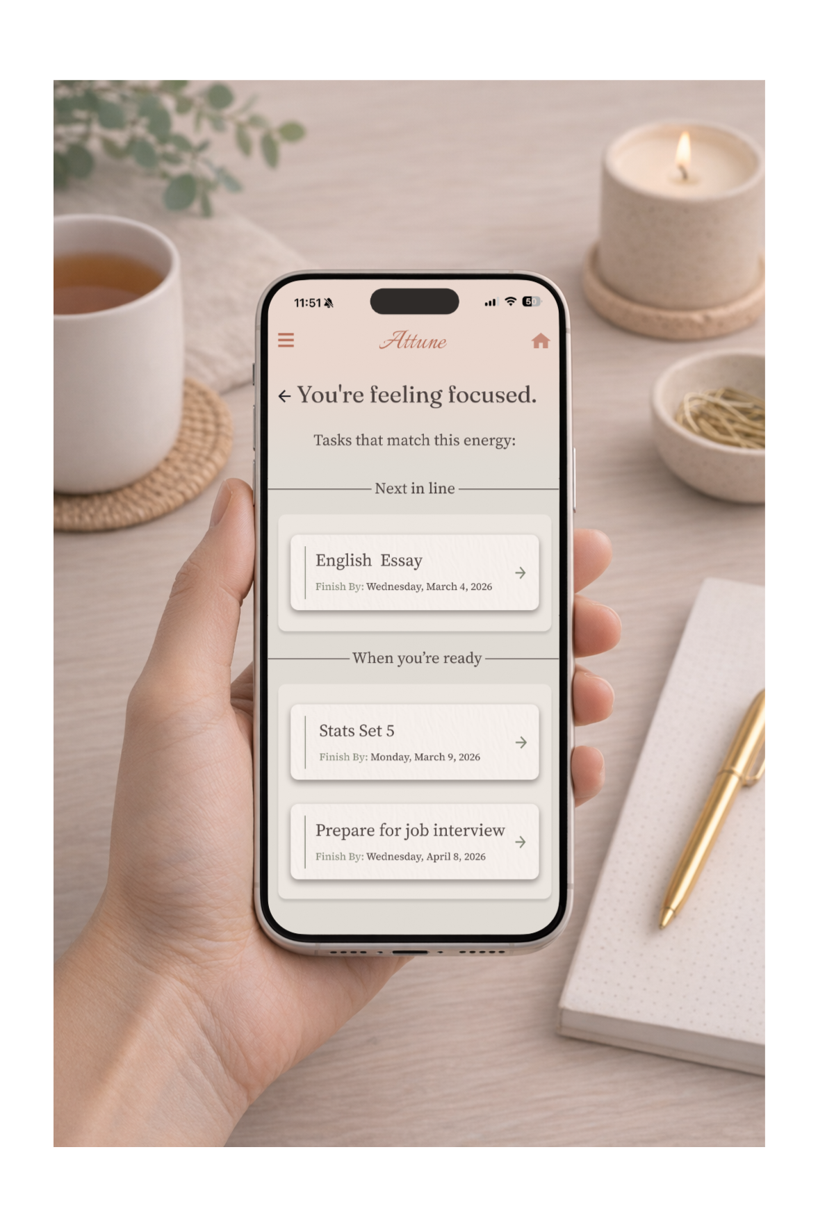
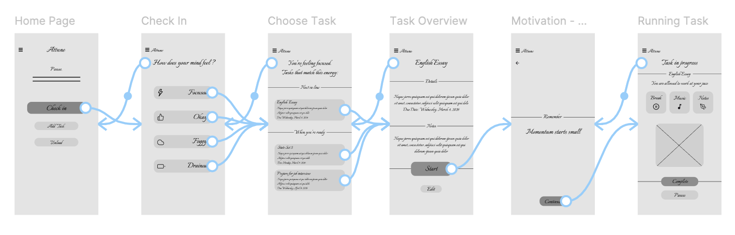
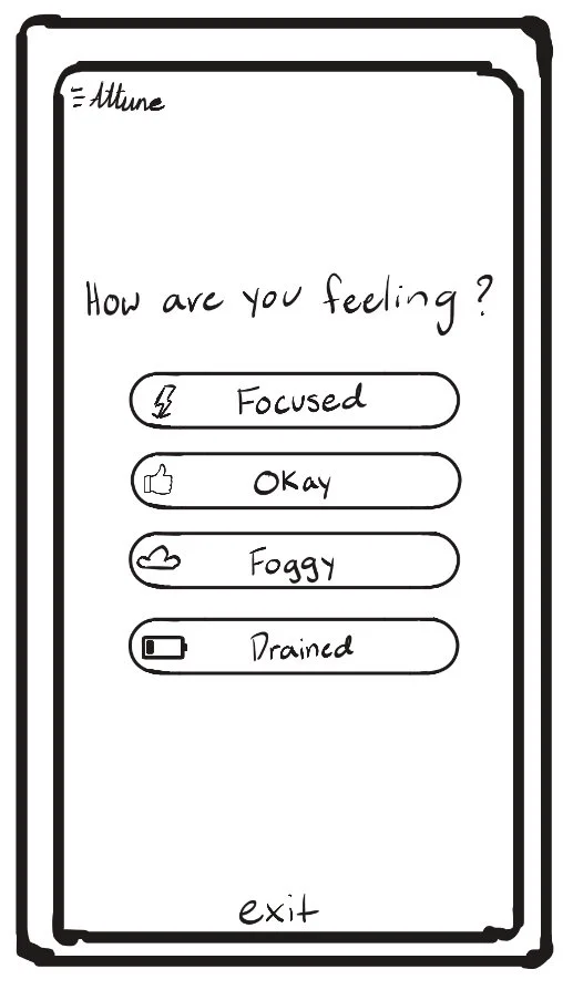
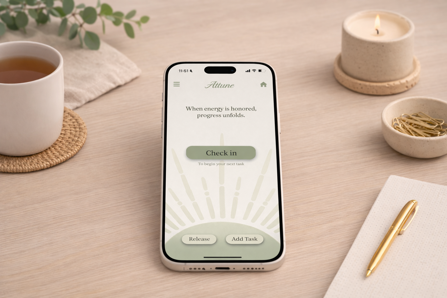
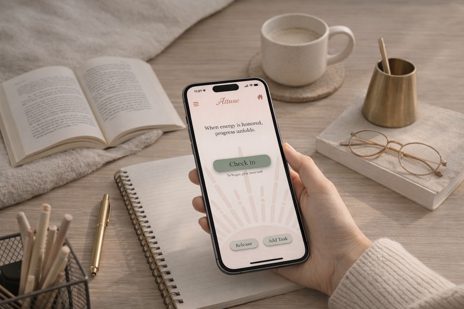
After check-in, users select their current mental state and Attune suggests three tasks filtered by energy level, prioritizing the most urgent. Tasks can be divided into smaller steps with assigned energy levels, while all remaining tasks stay accessible in the full task list.
Low-stress visual design
Muted green and terracotta tones, simple cards, large spacing, and limited tasks keep the interface calm. No streaks, warning colors, or pressure indicators, and only three tasks are shown after check-in.
Recovery features
Users can pause, take breaks, or clear their thoughts without losing progress.
Many people struggle to stay consistent with task-management apps because their energy, focus, and motivation change throughout the day. Survey research showed that rigid deadlines, overwhelming task lists, and pressure-based productivity systems can increase stress, leading users to avoid tasks or feel guilty when they fall behind.
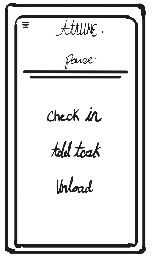
Low-Fidelity prototype
Creating an interactive version to test user flow
I built an interactive low-fidelity prototype in Figma to evaluate layout and overall user flow before moving on to high-fidelity designs
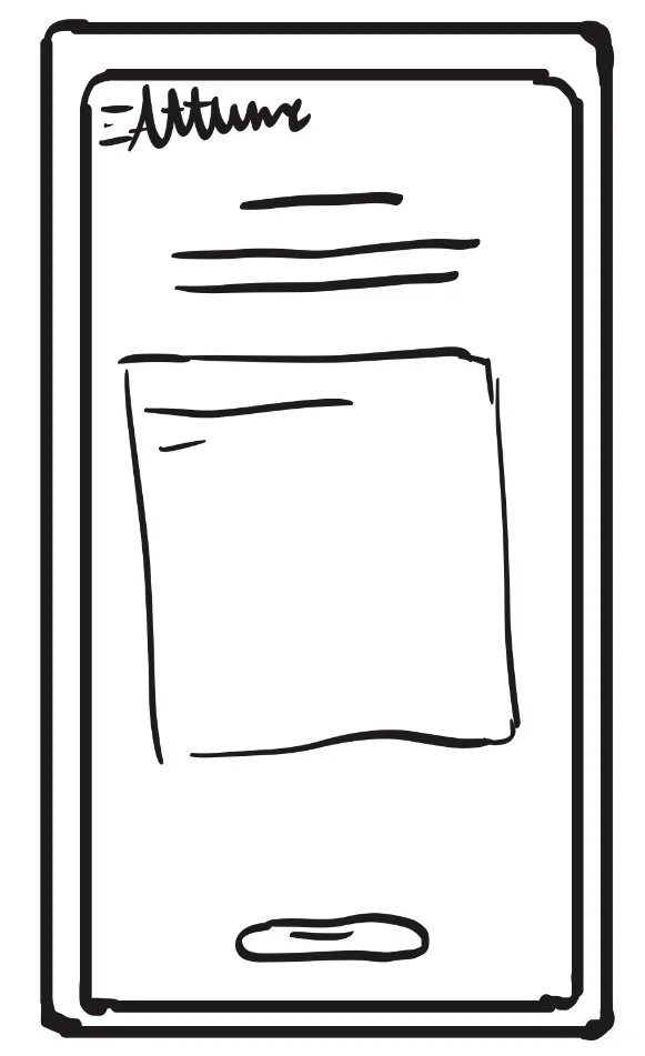
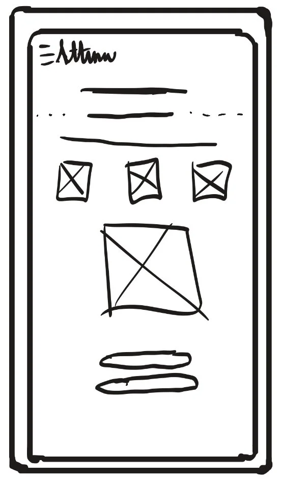
Wireframes
Early Layout ideas and screen structure
Exploring screen structure and layout to support the design goals defined in the ideation phase.
Prototyping
Study Goal
The goal of the usability study was to evaluate the low-fidelity prototype by observing how users interacted with the app while completing common tasks. The study focused on measuring ease of navigation, clarity of labels, task flow, and overall usability, while identifying pain points and areas for improvement to inform the next iteration of the design.
Methodology
Participants were asked to complete a series of typical actions using the low-fidelity prototype, including adding a task, starting a task, taking a break, writing a note, and reviewing daily progress. Each session was observed to evaluate how easily users could navigate the interface, understand the purpose of each feature, and follow the intended workflow. Notes were taken to identify areas of confusion, usability problems, and opportunities for improvement.
Key Findings
Most users were able to complete tasks easily without feeling overwhelmed.
Some users were confused by the wording of the Check-in button and were unsure what it meant at first.
The menu / overview button was not always noticeable and could blend into the layout.
Users liked the idea of choosing tasks based on how they felt, and said the app felt more flexible than typical productivity apps.
Participants said the app felt calm and not stressful to use.
Changes Made
Simplified wording in several areas to make actions clearer
Updated the label for the check-in feature to make its purpose easier to understand
Increased visibility of navigation buttons
Adjusted layout to make the flow easier to follow
usability testing and evaluation
Conducting usability testing to observe how users interact with the prototype, identify pain points, and guide design improvements.
Testing
5/6
missed the menu button/daily overview at first
4/6
Completed most and/or all tasks easily
6/6
Said the app felt calm and easy to flow through
5/6
Were confused by the check in hierarchy and/or wording
Participants
6 Participants
Ages 18 - 30
College students, Part-time Workers, and full-time workers
All regular users of productivity/task apps or similar platforms
Outcome
Tasks Tested
Add task
Check in
Start task
Add note
Take break
Complete task
Review progress
Said some screens had too much wording or felt cluttered
5/6
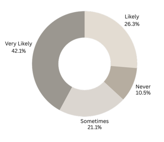
4/6
Would use this app and believe it would help them
Updating app based on usability study
Design updates were made based on usability testing feedback to improve navigation clarity, button hierarchy, and overall flow, with a focus on making the home screen easier to understand.
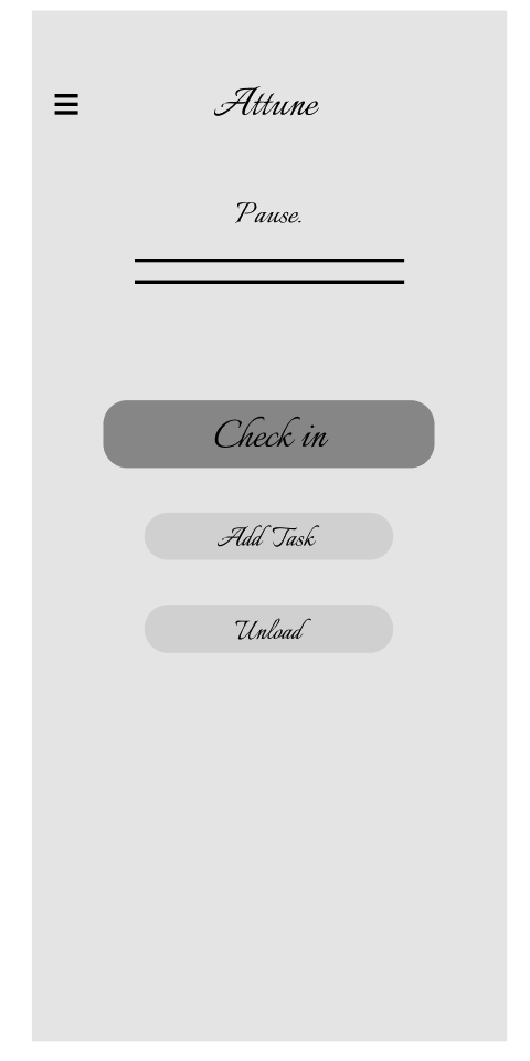
The usability study revealed that the majority of pain points occurred on the home page, where users experienced confusion with navigation visibility, button hierarchy, and the wording of the check-in feature. Based on this feedback, the layout and labeling of the home screen were updated to improve clarity, make primary actions easier to find, and create a more intuitive starting point for the experience.
Additional small adjustments and wording refinements were made across other screens, but the main focus of this iteration was improving the usability of the home page, since it is the primary entry point for the app.
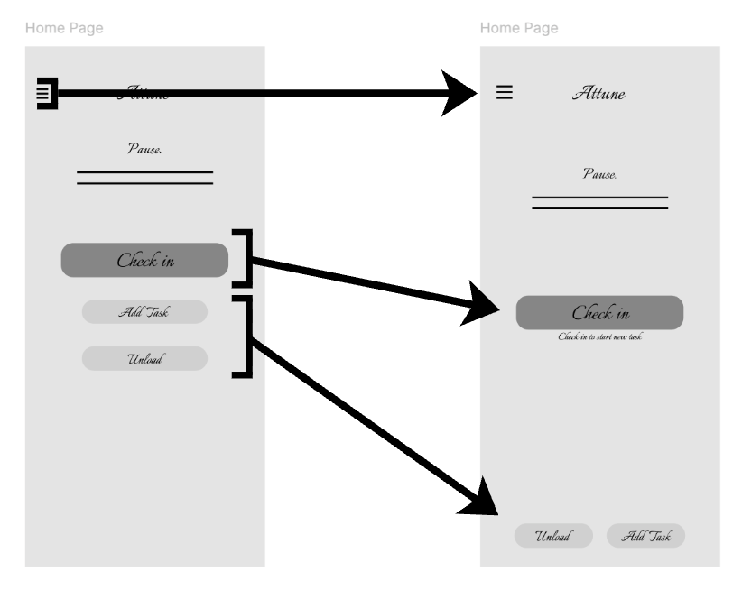
Increased visibility of menu button
Updated button hierarchy and label
Updated button hierarchy
Iteration & Refinement
tone
The tone of Attune was designed to feel calm, supportive, and non-overwhelming. Research was done on how color, texture, and motion influence stress and focus in digital environments, which guided the use of muted colors, soft textures, and subtle movement throughout the interface. These choices were made to reduce cognitive load and create a more balanced, encouraging productivity experience.
visual style
The visual style of Attune was designed to feel calm, soft, and low-stress. Research on how color, texture, and motion affect emotional response guided the use of muted green, red, and cream colors, subtle textures, and gentle transitions. Simple layouts and minimal visual elements were used to reduce cognitive load, ease the flow through the app, and create a more balanced, comfortable user experience.
attune Style guide
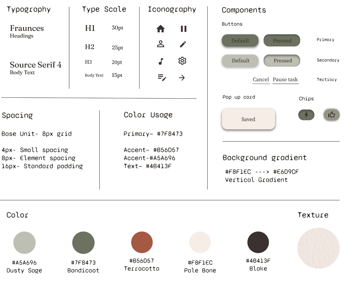
Design System & Visual Style
PRODUCTIVITY THAT ADAPTS TO HOW YOU FEEL.
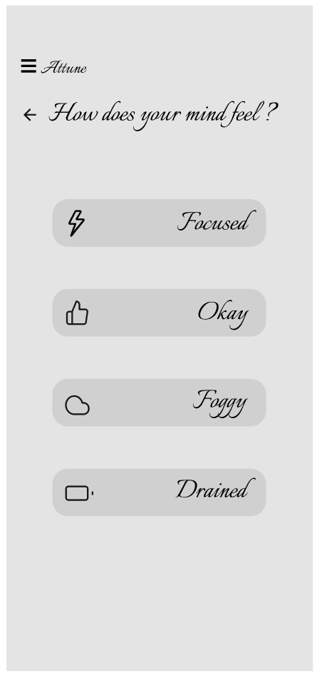
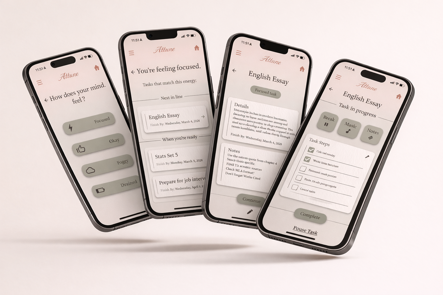
Attune begins with a quick check-in to understand the user’s current focus and energy level. After the check-in, instead of showing all tasks at once, Attune suggests only three tasks that each align with the user’s selected energy and focus. This interaction reduces overwhelm and fatigue by guiding users toward actions that fit their mental state, helping them start with manageable tasks instead of feeling discouraged by a full list of responsibilities. The suggested tasks include a simple overview with only essential details and user-written notes, designed to make getting started feel easier and less overwhelming.
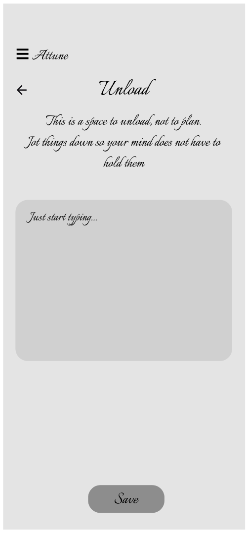
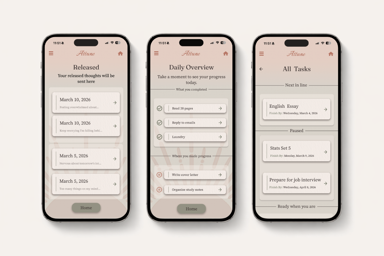
Released screen uses a clean list layout to keep saved thoughts easy to review, reducing visual clutter and supporting Attune’s low-pressure experience.
Daily Overview screen presents progress in a neutral format so users can reflect on their day without reward, punishment, or urgency influencing the experience.
All Tasks screen uses card grouping and generous spacing to show the full task list without overwhelming the user visually.
Limited task visibility on primary screens reduces cognitive load by showing only what is needed, keeping the interface focused and manageable.
Soft visual hierarchy and muted color choices prevent the interface from feeling urgent, supporting Attune’s goal of calm, sustainable productivity.
Consistent layout patterns across screens create predictability, helping users navigate the app without needing to relearn interactions.
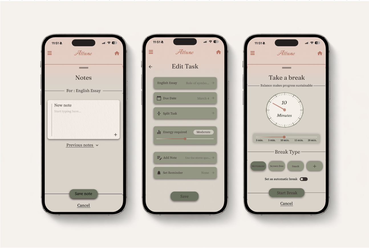
Notes screen uses a minimal input layout to keep writing quick and frictionless, allowing users to add thoughts to tasks without breaking their flow.
Edit Task screen uses grouped controls and clear sections so users can change task details without feeling overwhelmed by too many options at once.
Break screen uses simple presets and visible controls to make taking a break feel intentional while keeping the interaction easy to start and exit.
Large touch targets and simple actions reduce interaction effort, helping users make changes quickly without needing to think through the interface.
Soft colors, rounded cards, and consistent spacing create a calm visual system that supports Attune’s goal of low-stress, sustainable productivity.
Clear hierarchy and predictable layout patterns help users understand where to look next, keeping the experience intuitive across different screens.
Usability driven final design
Changes after usability testing included clearer hierarchy, simplified actions, and reduced visual clutter to make the experience feel calmer and easier to understand.
High-Fidelity Design
Reflection and Next Steps
Reflection
This project reinforced how thoughtful design decisions can significantly influence the way a product feels to use. Throughout the process, I learned the importance of balancing visual design with usability, and how adjustments to spacing, hierarchy, and color, such as the refinements made to the home screen layout, can meaningfully reduce cognitive load and improve clarity. Research findings and usability testing guided my design decisions, particularly when simplifying layouts, selecting color and animation, and ensuring that primary actions were easy to locate.
Working on Attune also deepened my understanding of how design can support emotional experience in addition to functionality. Through the use of muted color palettes, consistent component patterns, and clear visual structure, I aimed to create an interface that feels calm, supportive, and low-pressure rather than overwhelming.
Overall, this project strengthened my ability to move from ideation to research insights and finally to intentional design solutions. As my first complete UX case study, Attune helped develop my skills in iteration, usability evaluation, problem-solving, and designing with purpose, and it reinforced my motivation to continue learning and growing as I progress in my design career.
Next steps
If this project were to continue, the next step would be to conduct additional usability testing with more users to further refine navigation, task organization, and the break system. Future iterations could also explore personalization features, such as allowing users to customize layouts, colors, themes, or productivity styles based on their energy level, preferences, or comfort. Giving users control over visual themes could help the interface feel more supportive and adaptable to different moods or preferences while maintaining the calm, low-pressure experience the design aims to create.
Additional features like mood tracking, adaptive task suggestions, and reminders based on user behavior could help make the experience even more responsive to individual needs. Continuing to test and refine the design would ensure that Attune stays aligned with its goal of promoting sustainable productivity and reducing stress rather than increasing it.